Iconography of the U.S.

Through studying the many realms of communication through various courses, I have come to learn that icon has a number of different meanings. Throughout Comm265, Visual Rhetoric Visual Culture, we have been studying iconic photographs, those photographs that which have passed that test of time and because of many characteristics still hold deep meaning and relevance after many years. In terms of semiotics, an icon is a representative symbol of something. An example of this may the images (or icons) that represent the applications on a smart phone- Instagram’s icon of a camera in order to represent the purpose and use of the application.

maxresdefault-1

In the United States of America, there are a number of icons that encompass the United States. One of those icons is the Cinderella Castle made famous by Walt Disney parks and film. The Cinderella Castle that appears are the beginning of each Walt Disney Pictures film and that is also the centerpiece attraction for the American Walt Disney World’s Magic Kingdom Park. The Walt Disney Company,  that has had such a strong presence in the United States of America since early stages of animation entertainment , now, as a media conglomerate, has a number of different business subgroups that help to spread the brand in mediums such as film, television shows, radio stations, magazines, books, theme parks, and much more. Because of this strong presence, Disney’s repetition of the Cinderella Castle has been a prime example of culture industry thus allowing it to become an icon of the United States.

Although an icon of the U.S.A., the Cinderella Castle is also employed outside of the United States in Tokyo Disneyland, located in the capital of Japan. Through research, it has become evident that Tokyo Disneyland integrates the Cinderella Castle in order to appropriately market theme park and the overall cultural response to this usage has been positive. According to Themed Entertainment Association, Tokyo Disneyland holds second place to Walt Disney World in Orlando, Florida, U.S.A. for the top number of annual attendees to a Walt Disney amusement park. Concerning the U.S. response tho this usage was more rather positive than negative. Although the success of Tokyo Disneyland may not be relevant to commoners of the United States, the elites that supervise the media conglomerate of the Walt Disney Company may see the success of the company’s existence in Japan as a positive. I do not believe there is another icon other than the Cinderella Castle that would pose as an appropriate icon in Tokyo Disneyland. Because of the ambiance and and sense of childishness that Tokyo Disneyland wishes to create, the Cinderella Castle is the most appropriate icon to include in both advertising as well as the park itself.

magical_places_03

The thinkers from Sturken and Cartwright’s (2009) “Practices of Looking” that best fit this assignment are communication scholar Armand Mattelart and cultural critic Ariel Dorfman. Mattelart and Dorfman discuss how Donald Duck was once used by the United states in order to sell ideas “to promote ‘good neighborliness’ in South America in the 1940s” (Sturken & Cartwright, 2009, p.398). Although I do not believe that the United States based media conglomerate of The Walt Disney Company has implemented agenda setting such as the example of Mattelart and Dorfman’s Donald Duck theory however I do believe that the use of the Cinderella Castle is used to achieve business purposes for their location in Japan.


Cartwright, L., & Sturken, M. (2009). Practices of looking: an introduction to visual culture. New York, NY: Oxford University Press Inc.

Tokyo Disneyland Honeymoons. [Image]. (n.d.) Retrieved from: http://as1.wdpromedia.com/media/honeymoons/honeymoons/slideshows/magical_places_03.jpg

Walt Disney Studies-The Castle-Logo. [Image]. (n.d.) Retrieved from: https://i.ytimg.com/vi/Z8IHW0EfhAg/maxresdefault.jpg

The Brain/Pharma Ads Specifications

Part 1:

In two of the provided websites for this assignment there are interactive, 3-dimensional diagrams of the human brain that offer a copious amount of information. The information included within these diagrams include clear labels of each of the different sections of the brain as well as functions that coincide these sections of the brain.

From simply viewing the anatomy of the brain given these two websites, I do not believe that I have been persuaded in any ways in change my behaviors to improve brain function. Together, the websites offer a great deal of information that informs the readers about disorders or other negative aspects that the brain can endure such as ADHD, Alzheimer’s, autism, bipolar disorder, depression, and schizophrenia as well as potential affects of cancer, physical injuries, skull fractures, and ruptures of blood vessels. Although there is a lot of information about how the brain can be negatively effected, I am not persuaded to change any behaviors to improve brain function because these websites do not seem to supply one with information on how to do so.

Although I had not been persuaded to change any behaviors to improve brain function, the websites given did, however, help me to understand the function of the brain more than I did before. Because of the websites’ great deal of information, especially the Healthline website, I now have a better understanding of specific parts of the brain and their direct relationship to our functions as humans.

I believe quite strongly that the 3-dimensional, interactive diagrams of the brain are a good example of the idea that “the truth can be made visible.” Up until quite recently, interactive diagrams that allow a viewer to to learn in such ways that these websites allow did not exist. Today, being able to clearly see and interact with the human brain online allows us to see the “truth” of who we are.

The two simulations are similar in the ways that they allow the viewer to interact with specific parts of the brain however they are different with the amount of specific information that they offer about the brain. For example, the Healthline website gives specific examples of what functions each part of the brain does.


Part 2:

This 2007 ad for the sleeping pill Lunesta stresses insomnia relief — not the relative usefulness of the dru

The pharmaceutical direct-to-consumer advertisement that I chose to analyze is a Lunesta advertisement. This advertisement has a list of symptoms, however not in a checklist format, that interpellate the viewer: “Soothing rest for the mind and body,… peaceful sleep without a struggle,… helping most people fall asleep quickly, and stay asleep all through the night,… approved for long-term use,… feel comfortable taking it night after night.”

The conditions in which the drug intends to treat are insomnia and other conditions that prevent one from sleeping. This advertisement for Lunesta also includes the side effects: “unpleasant taste, headache, drowsiness and dizziness.” This list of side effects, however, is not longer than the list of symptoms. With the image of a man sleeping, appearing relaxed, and the text ensuring a good nights’ sleep, this ad promises the consumer that with using Lunesta, a relaxing, useful nights’ sleep is the inevitable result of using this product.

The theorist that best fits this assignment is Raymond Williams. Williams, a well-known analyst stated that advertising acts as a “‘magic system’ that transforms ordinary, material products into objects that promise a magical transformation” (Sturken & Cartwright, 2009, p.382). William’s analysis of advertisements connects to this assignment because of Lunesta’s almost magical promise to help one sleep peacefully through the night.


Cartwright, L., & Sturken, M. (2009). Practices of looking: an introduction to visual culture. New York, NY: Oxford University Press Inc.

Lunesta [Advertisement]. (n.d.). Retrieved from: http://media.npr.org/assets/img/2014/07/25/lunesta_ad_enlarge_custom-f19de67297791217d02da0b653520601605b6c6e.jpg

Pastiche

196472The artistic imitation of work, or pastiche, can be found in nearly every realm of artistic expression today. Between music, film, television, and much more, this imitation and reworking art of the past is a commonly incorporated element that presents for a both a familiarity and a freshness to a viewer that completely new content simply does not allow.

One example of pastiche in the film industry is the popular film series Scary Movie. Scary Movie is a comedic film series that is a pastiche of popular horror films created in the past. Throughout the film series, Scary Movie displays blatant references and imitation of former horror films’ plots and characters including I Know What You Did Last Summer, Scream, The Sixth Sense, The Blair Witch Project, The Shining, Psycho, and much more. The Scary Movie series is a definite reworking of the past. Because of the many references and imitations of past horror films, Scary Movie allows for an alternative, comedic reading in comparison to the formerly viewed horror films. In this specific instance, the pastiche of horror films that the Scary Movie maxresdefault
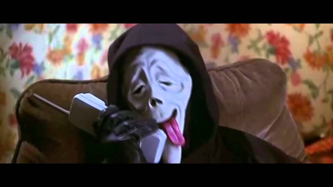
series allows is, in fact, a parody. What makes the Scary Movie series also parody films is because of the deliberate exaggerations that are created for comic effect. Not only does Ghostface from the film Scream appear in the Scary Movie series however his face is warped to create a slightly ridiculous expression that displays comedic and parody elements.

A website that cleverly pulls at the ideas of pastiche and parody is GraphJam.com. To explain quite briefly, GraphJam is a website that hosts a collection of comedic, graph-like images. The graphs and charts shown on GraphJam graphs are a pastiche of serious, research based graphs that typically reveal quantitative and important information. The graphs and charts shown as well as the entire website can be considered a reworking of the past. The forms and organizational patterns that are utilized are pulled from forms already created and simply reworked to meet the website’s content standards. GraphJam is also not solitarily pastiche only however pastiche and parody. Because of the elements of exaggeration for comedic effect, GraphJam displays forms of parody.

One specific graph titled “When I Was Your Age…” is a clear example of pastiche and parody. Pulling at characteristics of a typical quantitative graph, such as a steep rise and drop, this graph both imitates existing graphs and while exaggerating for comedic effect. This particular graph also questions the status of the original. “When I Was Your Age…” blatantly pokes fun at the typical stories adults tell young children about their journeys from home to school; the stories go somewhat like the following: “When I was your age, I would have to walk fifteen miles to school… through the snow… barefoot… uphill… both ways!” Using these stories as the reference, this graph in particular questions and mocks these original stories as a whole.h4FD7D7BF

The thinker that best fits this assignment from Sturken and Cartwright’s (2009) “Practices of Looking: An Introduction to Visual Culture” is the film theorist Richard Dryer. Dryer writes that “the primary way to understand pastiche is as an imitation that announces itself as such and that involves combining elements from other sources” (Sturken & Cartwright, 2009, p. 328). Dryer’s analyses and explanation of pastiche helps us to understand what the concept of pastiche really means.


Cartwright, L., & Sturken, M. (2009). Practices of looking: an introduction to visual culture. New York, NY: Oxford University Press Inc.

Scary Movie [Movie poster]. (2000). Retrieved from: https://upload.wikimedia.org/wikipedia/en/2/29/Movie_poster_for_%22Scary_Movie%22.jpg.

Wazzuuuuuup [Image]. (2000). Retrieved from: https://i.ytimg.com/vi/rlKwj9fpxk4/maxresdefault.jpg.

When I Was Your Age. [Image]. (n.d.). Retrieved from: https://i.chzbgr.com/full/4518395904/h4FD7D7BF/


Culture Jamming

Screen Shot 2015-11-03 at 10.39.42 PM             Screen Shot 2015-11-03 at 10.43.34 PM

The choosing of this particular ad was a bit of a process. At first, I was not exactly sure which ad I was going to use as my subject of culture jamming. Looking through Forbes’ most popular companies, I saw that Marlboro cigarette company is #27 on the list of the world’s most valuable brands. Not being a fan of cigarettes, I was a bit disgusted. Because of this, I believed that reworking an advertisement for Marlboro cigarette company to provide an oppositional reading would be both interesting and a bit entertaining. The reason why I chose this specific advertisement was because I wanted to manipulate the Marlboro logo in order to create an opposition reading as well as push against the ideas constructed within this particular advertisement.

The way I went about brainstorming an oppositional reading for the Marlboro advertisement was thinking about the negative aspects that are related to cigarettes. In the original advertisement, Paul Hornung, the halfback for the Green Bay Packers, is depicted smoking a Marlboro. Including the signifier of a successful, wealthy athlete, the viewers can easily link this success and wealth to the Marlboro cigarette company. This link of the signifier and signified was the inspiration that drove me to create the culture jam that I did. More specifically, the idea that stuck with me most was the amount of money that cigarette smokers spend throughout their lifetime. With the cost of a pack of cigarettes up to approximately $5.00, smoking cigarettes is a very expensive habit. The unnecessary expenses that come with cigarette smoking was inspiration for my oppositional reading.

In creating this culture jam oppositional reading, I decided to manipulate the text on the traditional Marlboro cigarette pack. Using the image editing software Google Draw, I first changed the name “Marlboro” that is displayed on the pack to the phrase “Money burner.” Regarding the design aspect, I made sure to enlarge the “M” and elongate the “b” in order to resemble the original typography. On the bottom of the pack which normally states “20 class A cigarettes” on the Marlboro cigarette packs, I included additional text that reads “20 expensive cigarettes.” Again, regarding design, I attempted to arrange the text and select a color that would reflect the original design.

The theory from Sturken and Cartwright’s (2009) “The Practices of Looking: An Introduction to Visual Culture” that I believe fits this assignment is commodity fetishism. The reason why this term fits this assignment is due to the contents of the original Marlboro advertisement. Commodity fetishism is described as a process of emptying out unwanted meanings established with products and filling “them with new, appealing meanings, such as empowerment, beauty, and sexiness” (Sturken & Cartwright, 2009, p. 282). In the original advertisement, Marlboro attempts to sell their product using appealing meanings such as these. Using Paul Hornung in their original advertisement, Marlboro not only attempts to sell the cigarettes but also the good looks, success, and, most specifically, the wealth that Hornung adds to the advertisement.


Cartwright, L., & Sturken, M. (2009). Practices of looking: an introduction to visual culture. New York, NY: Oxford University Press Inc.

Media Tracking

social-media-monitoring

In today’s day and age, the use of media is an everyday part of college students’ lives. Whether the use of media is to utilize the internet to access an online textbook or see what your friends are up to on social media, media use is, if not appears to be, an essential part of everyday life and functionality. Recording my use of media for a span of forty-eight hours, I am able to track my media use and come to conclusions about this subject. First of all, the form of media I used the most was the internet in the form of completing classwork and my internship. Utilizing the internet to access an online textbook, use Roger Williams University cite “Bridges,” referring to APA citation websites, using the Roger Williams University Directory for my internship, and researching local charter buses also for my internship, I utilized the internet for academic or work purposes for a total of seven hours and forty-five minutes.

The form of media that I used the least (but still used) was e-mail. Mainly only opening email and quickly reading or instantly deleting them, in the case of SPAM, I did not spend much time using email at all. Using email only approximately twenty-five minutes within the forty-eight hour documented timespan, the majority of the reason that number is even twenty-five is because I need to draft and send a few brief emails.

The amount of time spent communicating with another person over media was about about two hours and five minutes. I spent twenty minutes of e-mail, forty-five minutes on the telephone, and about one cumulative hour or text messaging (Apple messaging, WhatsApp, and Facebook Messenger).

Regarding monologic media usage, I spent approximately two hours and fifty-five minutes on this form of media. This time was spent utilizing television for one hour and twenty-five minutes and listening to the radio on my commute to campus for a total of one hour and fifteen-minutes.

The thing that surprised me the most about my time spent engaged in the use of media was the amount of time I did not utilize social media. Within the forty-eight hour timespan, I only used social media (Facebook, Instagram, and Snapchat) for fifty-five minutes. I think the reason why this number surprised me is because today, young people, including college students, are constantly portrayed as people who “cannot get off of their phones” and “always on social media 24/7” however I only engaged in social media for less than an hour in two days. On the flip-side, however, I was also shocked with how much time I spent engaged in work and classwork related media. I was not surprised by this because of the assumption that I would not engage in classwork outside of class however because of the large difference in time spent academic and professional internet use in comparison to everything else. While I spent over seven hours on the internet in order to complete tasks for class and work, the media platform that I engaged in the most following this was television, again only spending an hour and twenty-minutes engaged in this media.

Based on this exercise, I do not believe I will change anything regarding my media usage. To be honest, I was pleasantly surprised with the results I found during this media-tracking process. Noticing that I engaged in media primarily to benefit my studies and complete tasks at work through the internet, being a college student, I will attempt to keep my engagement with media this way.

The theorist that I believe best fits this assignment is Thomas Frank. Frank, as described by Sturken and Cartwright (2009) in “Practices of Looking,” argued the existence of counterculture in advertising in order to “make certain brands seem hip and cool” (p. 294). The idea of counterculture is what stuck out to me most. Describing counterculture as a “cutting-edge cool [that makes something popular] one month becomes uncool the next when a particular look or item goes mainstream” (p. 294). The way I connected Frank’s counterculture to my media-tracking was by analyzing the social media platforms I used when I was engaging in social media: mainly dominated by Instagram and Snapchat. If I were assigned to a media-tracking assignment two or three years ago,  however, the social media platform I would most certainly be using the most would be Facebook, for example. Because of the mainstream popularity of Facebook among older generations, I, along with what I assume to be the majority of young people, have engaged in active counterculture as I have moved away from Facebook and rather to other social media platforms such as Instagram and Snapchat.


Cartwright, L., & Sturken, M. (2009). Practices of looking: an introduction to visual culture. New York, NY: Oxford University Press Inc.