Creative Commons

CC-by-nc-sa

Creative Commons is an organization that values the legal sharing of creative work. Enabling the modification of copyright terms and licensing, Creative Commons gives the public access to view, share, and modify another’s work in ways that best suits the creator. This is to say that if a content creator only wishes to allow their work to be used by the public and not for commercial use, copyright terms are adjusted in order to protect both the creator and the person using the work found on Creative Commons. This platform for content sharing, stores a wide variety of mediums such as images, audio, video, and even academic material available for public and legal use.

Creative Commons allows a less ambiguous and safer understanding of ownership and copyright. Regarding the subjects and of a work, utilizing Creative Commons, there is a direct relationship between the content creator, or owner, and the person utilizing their medium. This platform that helps manage a middle ground between the two and allows for owners to share their content and those who want to use it on a permission-based relationship. Regarding copyright, I believe Creative Commons’ shift from “all-rights-reserved” to “some-rights-reserved” system of copyright also helps to create a safe space where people are able to use the content available and do not have to maneuver their way around copyright terms in fear of abusing an owners’ content.

This idea of varied copyright terms is a relatively new concept. In the case of Gone With the Wind, a work of Sherrie Levine and Michael Mandiberg, the copyright laws were extremely strict in comparison to the Creative Commons’ terms available today. These strict laws enforced that the duplication and modification of this work was clearly illegal and an infringement of copyright laws. If, hypothetically, Levine and Mandiberg were to released Gone With the Wind in modern day, the use of Creative Commons would allow copyright terms that were less strict and, for example, the creation of a sequel would not violate such laws.

Regarding the protection to the right of publicity, Creative Commons does not afford this. Any media form shared on Creative Commons is viewable and usable by the public. Because of the terms agreed upon by utilizing this medium, the right of publicity is not protected.

In the case of Bela Lugosi, the original actor of Universal Pictures
Company’s film Dracula, in which his death left question as to the licensing agreements of the character, copyright laws were questioned and challenged. In the year 1966, Lugosi’s widow and son filed complaints against Universal Pictures Company stating that they, as heirs to Lugosi, disapproved of the appropriation of Dracula and stated that any of Universal’s profit gain regarding these appropriations belonged to them. Creative Commons at this time, as stated before when discussing Gone With the Wind, did not exist however the current existence of this platform eliminates a number of copyright terms and issues, such as the Lugosi case.

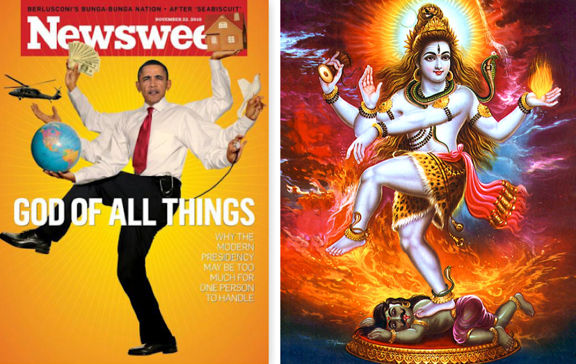
Because Creative Commons is a space where content can be modified and used in various ways, the owner of content cannot predict what ways his or her content will be modified and construed. In Sturken and Cartwright’s (2009) text Practices of Looking, John David Viera is mentioned when discussing the emotional or meaningful attachment that can exist between viewers and content. Discussing Dorothea Lange’s photograph Migrant Mother, it is discussed that there is a blatant “lack of ability to predict and control the meanings and uses of [an] image as it is reproduced and circulated in different contexts” (Sturken & Cartwright, 2009). Whether this inability to predict future meaning is reproduced work is positive or negative is unforeseeable however Creative Commons allows for Viera’s ideologies of constant change to hold true.


Cartwright, L., & Sturken, M. (2009). Practices of looking: an introduction to visual culture. New York, NY: Oxford University Press Inc.

Self-Portrait

Screen Shot 2015-09-29 at 8.55.23 PM

For this assignment, two materials were required: a photograph self portrait to portray my physical appearance and a self portrait created using signs, shapes and forms that describe me as a person. Providing the two, it is evident that there are a number of strong differences. In the photograph self portrait, I am shown sitting, facing the camera and smiling. A number of descriptions can be made about me from simply viewing this photo: blonde, thin, caucasian, and male to name a few. On the other hand, the self portrait made of signs, shapes, and forms allows for different descriptions to be made: pianist, tennis player, Roger Williams University Student, and Rhode Islander. Although the first photo can be used to describe me and allows me to be identified in a physical way, it does not say much about me as a person such as my hobbies, interest, and morals in such a way that the second, crafted self-portrait can. The differences of content and possible interpretations of these photos is what differentiates them the most.

Although clear differences can be made between the two self portraits, there are, however areas in which the two intersect. To mention the most obvious area of intersection upon viewing the two, it can be easily identified that I am male. Given my anatomical characteristics shown in the first photo and the profile silhouette in the second, this observation is both clear and accurate. A second connection I want to identify between the two self portraits is my personal connection to Spain. The second semester of my junior year I studied abroad in Granada, Spain in order to experience the culture, improve my Spanish language skills, and enrich my college education as a whole. What may not be evident at first glance, in the photograph, I am actually posed on the infamous mosaic-style benches designed my Antoni Gaudi in Park Güell located in Barcelona, Spain. In symbolic self portrait, I included the graphic that is shown on the Spain’s national flag to include my honor for the country.

Choosing the symbols to include in the symbolic self-portrait was not necessarily difficult to do. Briefly reflecting on my values, interest, and background, I was able to simply conjure up symbols to represent these aspects. There are seven main symbols incorporated in my self-portrait. The first, most central symbol, the male’s face is self explanatory: my identification as male. On top, piano keys are incorporated to show that I am musically inclined. The piano has influenced aspects of my involvement, methods of stress-relief, and interests for the past 11 years. Moving clockwise, the graphic on the Spanish flag shows my honor the European country through my travels and experiences. Next, included is a tennis racquet, again showing literal interest in the sport. At the bottom center, the blue and yellow hawk represents my place as a Roger Williams University student. Climbing up the left, the passports indicate my passion and and dreams of continuing to travel abroad. Lastly, the graphic that is shown on the Rhode Island flag is incorporated. Born, raised, and predominantly educated in Rhode Island, the small state holds a great deal of my self-identification.

An eighth piece incorporated in my self portrait is the oceanic background. Different from all the graphics mentioned before, this addition is truly symbolic. Referencing my attachment to the ocean, having lived by the Atlantic Ocean for my entire life, the ocean also symbolizes my “go-with-the-flow” outlook on life.

It could be argued that theorist Charles Pierce could be connected to this unit. As described in Sturken (2009) and Cartwright’s “Practices of Looking: An Introduction to Visual Culture,” Charles Pierce coined the term indexical sign to “indicate those signs in which there is a physical casual connection between the signifier (word/image) and the thing signified, because both existed at some point within the same physical space” (p446). Charles Pierce and his ideologies of indexical sign are relevant in this unit as it describes the photo self portrait and it’s ‘actual existence’ over the second, created portrait.


Cartwright, L., & Sturken, M. (2009). Practices of looking: an introduction to visual culture. New York, NY: Oxford University Press Inc.

Spectatorship and Power Relationships

In advertising, it is evident that spectatorship and power relationship are important aspects. How a spectator views, decodes, and interprets messages is important as well as the advertiser’s uses of power relationships throughout the advertisements. In this week’s assignment, we were set to find two advertisements: one showing only one person and another with two or more people and discuss the roles of subjectivity as well as dominance.

Screen Shot 2015-09-22 at 1.22.48 PMThe first advertisement I chose is for Nike. In this advertisement, there is a single, overweight adolescent running towards the camera. Surrounded by nothing but fields and what appears to be a long, empty road, it is evident that the boy has been running for a while. Although red in the face, sweaty, and clearly not having a very fun time, by the way his mouth is opened, his fists closed tightly, and his elbows bend, it appears that he is not stopping any time soon. Across his torso reads “Find your greatness” as well as the ‘Nike Swoosh.’ By the looks of this advertisement, it does not appear that the running boy is aware that he is the subject of this photo. Yes, the boy is running towards us, the camera thus the viewers, however his gaze looks past the camera lens. In such a simple, minimalistic image, it is evident that the boy is motivated and is exercising in his solidarity. Unlike other athletic advertisements, he is not ‘prettied up,’ rather working hard and thus ‘unaware’ of the photo being taken.

e23ac890db7ad118b2da26f16b42d51fFor the second advertisement, I discovered an image used to promote a company by the name of Zu Shoes. This advertisement is extremely different from the first in many ways. To point out the obvious, this advertisement shows more than one person, in fact, it shows quite a high number of people. This shoe ad shows a woman of high, even futuristic fashion walking confidently in high, silver heels. Behind her is a trail of shirtless men leading as far away as viewers can see. By the content of this advertisement, it becomes obvious that the woman in heels displays dominance and has power. One clear piece of evidence is the endless trail of men that follow her. Because of this woman’s attitude and looks, it appears, she is in a position of power and can easily manipulate men. Looking at the expression on one of the men’s faces, expressing emotions of fascination and desperation looking up at the woman, the men clearly desire the woman in heels greatly. She is in complete control in this advertisement.

Referring to Sturken and Cartwright’s (2009) “Practices of Looking: an Introduction to Visual Culture,” this second advertisement could be categorized as having elements of abstraction. As stated, abstraction “in advertising, … is used to describe the fantasy world separated out from reality that is created by ads” (431). In the advertisement for Zu Shoes it becomes evident that the shoe company attempts to create a fantasy world for its viewers; a world where a simple pair of shoes transforms a woman into a confident, irresistible goddess that has trails of men following her every move. Of course this fantasy world is not to be taken literally however advertising companies may lean toward methods of abstraction to appeals to their target audience.


Cartwright, L., & Sturken, M. (2009). Practices of looking: an introduction to visual culture. New York, NY: Oxford University Press Inc.

Appropriation in Popular Culture

Screen Shot 2015-09-11 at 6.54.03 PM

Cultural appropriation used in modern television, film, magazines, advertisement and other platforms, as described by Sturken and Cartwright (2009) is the continuing phenomenon of “‘borrowing’ and changing the meaning of cultural products, slogans, images, or elements of fashion” (p. 83). This borrowing or changing of meanings in already-established cultural entities can be used for a variety of reasons however it can be assumed that the individuals appropriating particular text, art, or imagery have an intent. Whether this intent is to manipulate, convince, or provoke thought, cultural appropriation has proven to be a useful method to convey a message to an audience.

One specific instance of cultural appropriation that fueled controversy was the cover of Newsweek Magazine back in November of 2010. The image depicted on the cover was a computer edited picture of President Barack Obama with multiple arms and balancing on one leg; an undeniable resemblance to the Hindu God known as Lord Shiva.

Lord Shiva is known as “the most powerful god of the Hindu pantheon and one of the godheads in the Hindu Trinity” (Das, 2015). It is also important to note that in the Hindu religion Shiva is also known as “the destroyer of the world” (“Newsweek Depiction of Obama as Lord Shiva…,” 2010). In various paintings and sculptures depicting Lord Shiva, it is not rare to see her posed on one leg, the other crossing her body, and her multiple arms spread open. As the Lord Shiva is depicted in this position, it is known as the cosmic dance or “‘Anandatandava,’ meaning the Dance of Bliss, [symbolizing] the cosmic cycles of creation and destruction” (Das, 2015). These images of Lord Shiva were known to represent the five principle manifestations of eternal energy “- creation, destruction, preservation, salvation, and illusion” (Das, 2015).

In November of 2010 when an image President Obama was depicted just the same as the Hindu God on the cover of Newsweek Magazine, it goes without saying that many American-Indians were extremely insulted however we are not going to focus on the backlash of the Hindu population but rather the use of cultural appropriation that went into the creation of this image. Similar to how Lord Shiva is presented during her cosmic dance, President Obama is presented in the same position. In front of Obama reads the news story headline: “God of All Things.” Within the magazine, the subheading of the referenced article is subtitled, “Why the Modern Presidency May be too Much for One Person to Handle.” It seems that the creator of this cultural appropriation had changed the meaning of the referenced image completely. Contrary to the meanings of the original image of Shiva, the graphic of Obama is meant to depict the many responsibilities of the modern day president. Shown with multiple arms, this image theoretically demonstrates that it would only be possible to successfully hold such responsibility if one had multiple arms. Displayed on one leg, this meaning and can pushed further as if to say, even if Obama had multiple arms, it would still be hard to skillfully balance all of these responsibilities.

Although the creator of the 2010 Newsweek Magazine had completely changed and created its own meaning, it is still important to point out that this is still an example of cultural appropriation. Whether this appropriation was to catch the eye of passersby or an attempted to increase sales of the magazine, just the position that President Obama is depicted in reference to Hindu God Shiva dancing the ‘Anandatandava,’ or cosmic dance, is appropriation because it borrows and changes the meaning of an already-established cultural image.


Cartwright, L., & Sturken, M. (2009). Practices of looking: an introduction to visual culture. New York, NY: Oxford University Press Inc.

Das, S. (2015). Lord Shiva. Retrieved September 11, 2015, from http://hinduism.about.com/od/lordshiva/p/shiva.htm

Newsweek Depiction of Obama as Lord Shiva Upsets Some Indian-Americans. (2010, November 21). Retrieved September 11, 2015, from http://www.foxnews.com/politics/2010/11/21/newsweek-depiction-obama-lord-shiva-upsets-indians/

Icons in our Society

150402163227-pillsbury-doughboy-780x439

The image icon I chose for this assignment is the Pillsbury Doughboy. Officially named Poppin’ Fresh, however more commonly known and referred to as the Pillsbury Doughboy, this icon has been appearing in advertisements for the Pillsbury Company since 1965. Since then, this iconic character has been the face, attitude, and branding strategy for the Pillsbury Company nationwide.

Appearing for five decades now, the this smiling, positive icon has been assisting family cooks in commercials, magazine advertisements, and more and has embodied a number of “universal” concepts and emotions for the Pillsbury Company. The stress-free environment created by the warm smile and happy-go-lucky gestures of the Pillsbury Doughboy exhibits concepts of simplicity for the Pillsbury Company, a company often advertising their minimal baking time, their convenient, ready-to-bake package design, and, well, simplicity. These stress and carefree characteristics illustrate emotions among the viewers aswell; these emotions include joy, amusement, and charm. Using such a noncontroversial icon, these universal emotions of happiness and comfort are easily attainable by the Pillsbury Doughboy with his positive attitude.

The advertisers of the Pillsbury Company have been able to connect these concepts and emotions of the Pillsbury Doughboy to their products by directly connecting and creating similarities between this icon to their products, typically biscuits or baked goods. How are these connections made? Much simpler than one might think: the Pillsbury Doughboy is plump and doughy, as well as their products; the Doughboy has a warm presence about him, as do their products. By simply creating an icon that expresses such joy and jauntiness and directly relating it to the products being sold, a connection between the concepts and product has been effectively created.

Personally, I believe I am persuaded by the Pillsbury Doughboy each time he appears in a printed advertisement. As stated before, because of the positive energy and noncontroversial aspects of this icon, he is easily likable, recognizable, and an effective image for the Pillsbury Company. Another aspect of the Pillsbury Doughboy that persuades me personally is his constant presence in a home kitchen. Growing up in a very close and family-oriented home that believes in the importance of home cooked meals, the Doughboy’s image of being the personal helper to the family-cook relates to me on another level and allows the icon to affect me stronger than it would for someone who, for example, grew up eating out at restaurants every night of the week.

Now referring to the assigned reading in the textbook “The Practices of Looking” by Sturken and Cartwright (2009), there is one thinker and theory in particular that fits this assignment. The theorist I want to reference is Stuart Hall, writer of a well-known essay titled “Encoding, Decoding” (p. 72). In this essay, he explains that there are three positions viewers can take as decoders, those who decode or interpret meaning from images that are encoded with meaning. The position that relates best to the Pillsbury Company’s well-known icon in regards to the creators’ encoded meanings and what I believe to be the majority of the viewers’ decoded interpretations is dominant-hegemonic reading. Dominant-hegemonic reading is explained such that “They [the viewers] can identify with the hegemonic position and receive the dominant message of an image or text… in an unquestioning manner” (p. 72). Hall’s explanation of dominant-hegemonic reading, to me, fits this case in particular because the iconic Pillsbury Doughboy is a positive figure and I cannot find reasons that the encoded meanings or intended interpretations of this icon would not match up with the decoded interpretations by the viewers.


Cartwright, L., & Sturken, M. (2009). Practices of looking: an introduction to visual culture. New York, NY: Oxford University Press Inc.